THE SOLUTION
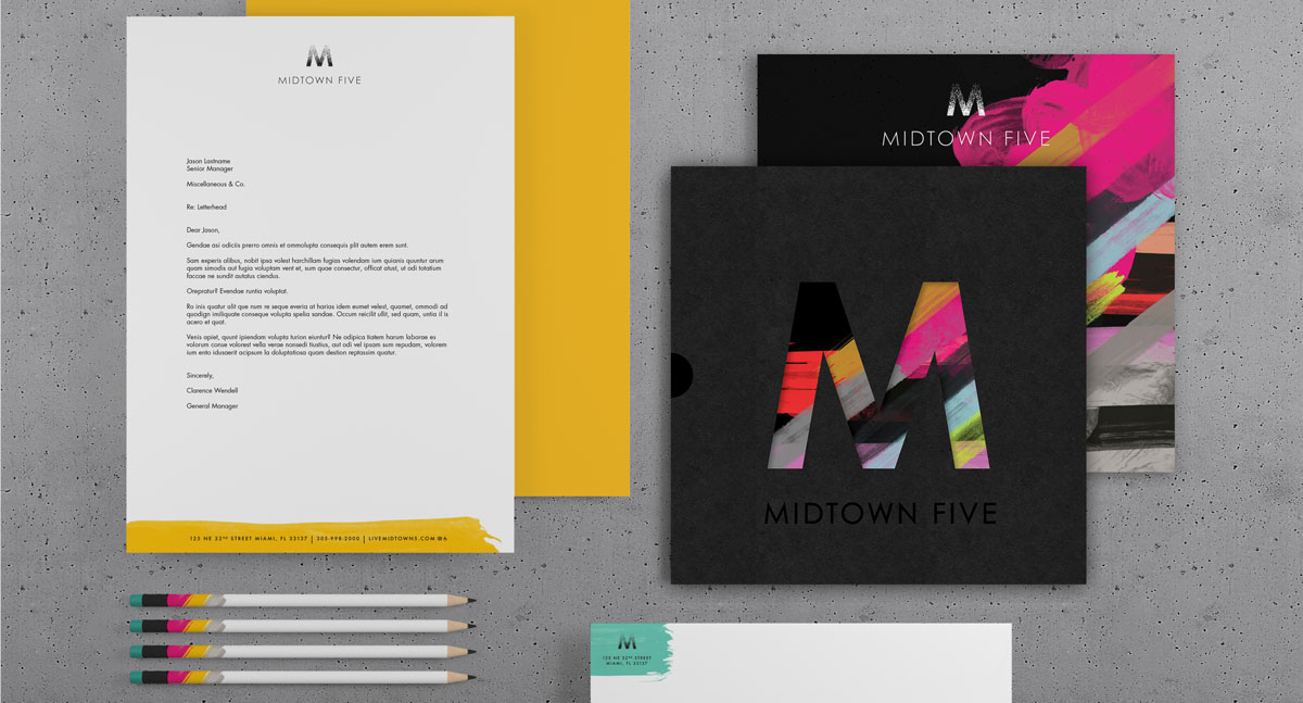
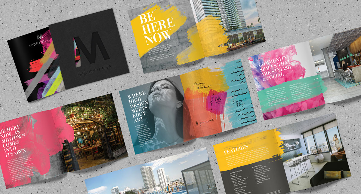
You’ve heard it before – in real estate, it’s all about location. In the center of Midtown Miami, Midtown5 is a part of an evolving neighborhood between the funky Wynwood Arts District and the stylish Design District. For the brand and for the building, we aimed to capture the excitement of this up-and-coming neighborhood while drawing on the cachet of its more recognizable neighbors. At its heart and its details, Midtown5 became a property that mixes high design with edgy art, all in a welcoming, social setting. Think Stella McCartney designing for Target. Think the combined whimsy and elegance of Jonathan Adler. Here, bright paint strokes meet sophisticated black & white photography. Here, bold local art meets refined finishes. Take a look at the photos and you’ll see the iconic chandelier that hangs over the reception desk serves as the inspiration for the property’s logo. The geometric rug that gives the lobby its color palette also appears on the website’s home page. The bold paint strokes and eclectic color palette that gives the brand its edge are reflected in the art that greets residents every day. So, from your first experience with the property to your last, the message and the aesthetic are one and the same.

